Q: Why did LEDC rebrand?
A: Because London Economic Development Corporation is a mouthful. It’s too long to say, hard to work with, and let’s be honest— internally and externally, people have been calling us LEDC for years. So, we decided to embrace it, own it, and finally give it the visual and strategic weight it deserves.
Q: What was wrong with the old brand?
A: The old brand wasn’t wrong—it served us well for 27 years—but it wasn’t right anymore. The logo lacked meaning on its own, relied too heavily on words, and didn’t reflect an organization focused on growth and investment. It was also hard to work with and difficult to apply consistently, which meant we were missing opportunities to clearly connect our identity to major initiatives. Now, with the refreshed brand, we can easily co-brand LEDC with our major initiatives such as Manufacturing Matters and London and Area Works, making it clear they are part of who we are.
Q: Why now?
A: Honestly? It was the perfect time. Global economic uncertainty has slowed the usual firehose of new projects. That gave us space to look inward, evaluate how we’re showing up, and make sure our brand reflects where we’re headed. It’s about being strategic, what comes next, and you know....it looks good.
Q: What does the new brand actually represent?
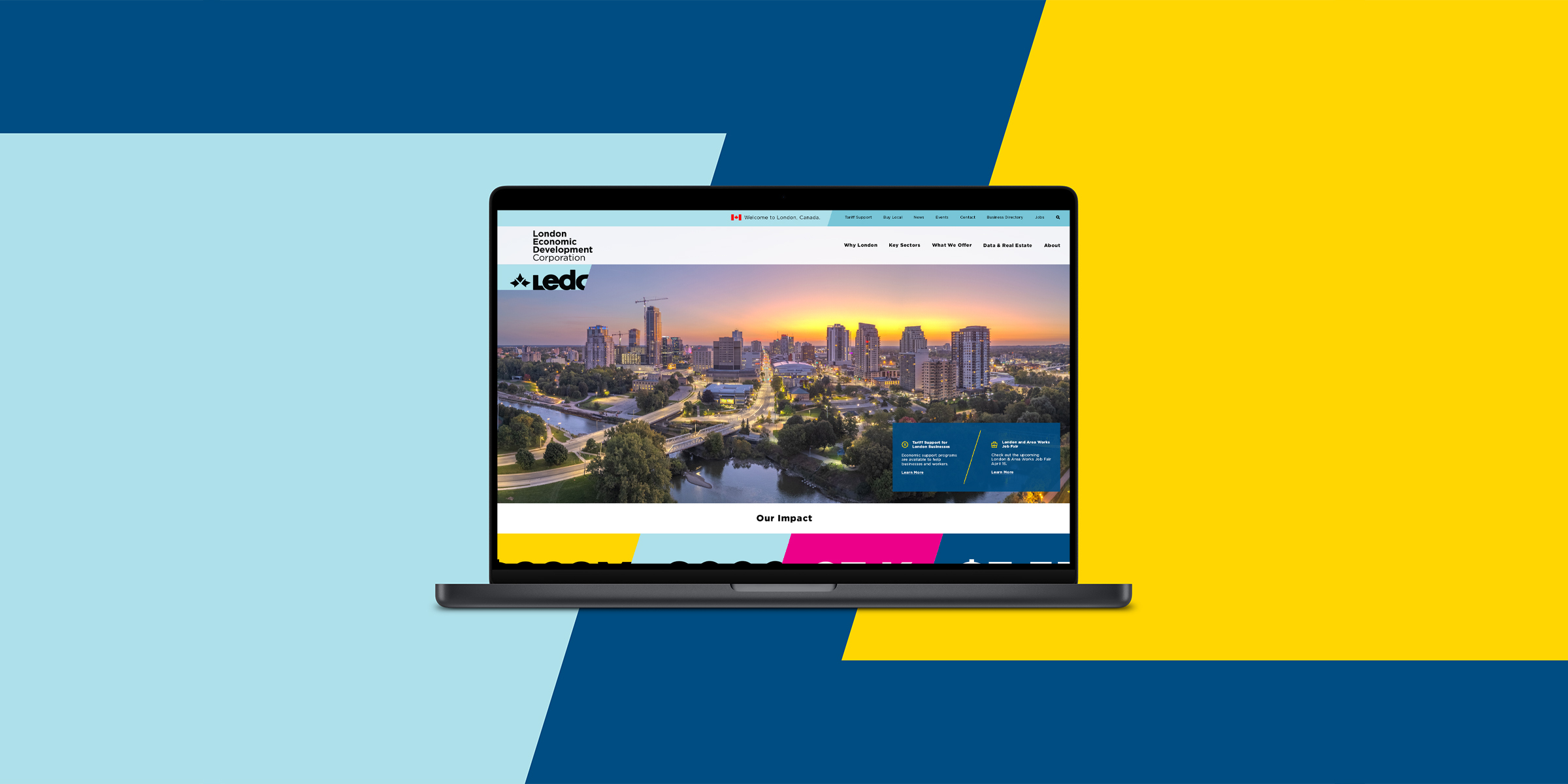
A: The new identity reflects what LEDC is: a connector. A convergence point for people, ideas, and industries. It’s bold, clean, and has real flexibility. The angled end—the blaze—literally points forward. A blaze is directional, provides wayfinding and reflects where we’re headed. It’s an invitation to move, build, grow, and partner. It's also shorthand for everything we support: innovation, tech, trade, talent, and more.
Q: Did this cost a fortune?
A: Not even close. We developed the new brand with long-time London partners—Blue Aardvark and rTraction, a certified B Corp—who know our organization inside and out. Because of those trusted relationships, the project stayed within our annual marketing budget. No added consultants. No bloated rebrand bill. Just thoughtful, strategic work with local firms that get it. And while there will be expenses to replace stationery, those will only come as supplies run out.
Q: What’s the deal with the new logo?
A: It leads. Literally. The forward slash at the end is a visual cue—we're ahead of the curve, moving forward, and ready to collaborate. It adapts easily, looks great with sub-brands like Manufacturing Matters and Life Sciences London, and gives us branding power in places we couldn’t before. It's clean, scalable, and doesn’t feel like it belongs on a mutual fund brochure.
Q: Are you just trying to look “cool”?
A: Kind of—but not for vanity. Our community is cool, diverse and, growing. And our brand should match that. Whether it’s creative industries,, advanced manufacturing, global markets, or diverse talent—we’re not stuck in a single identity. This new look raises the cool factor while staying professional and credible.